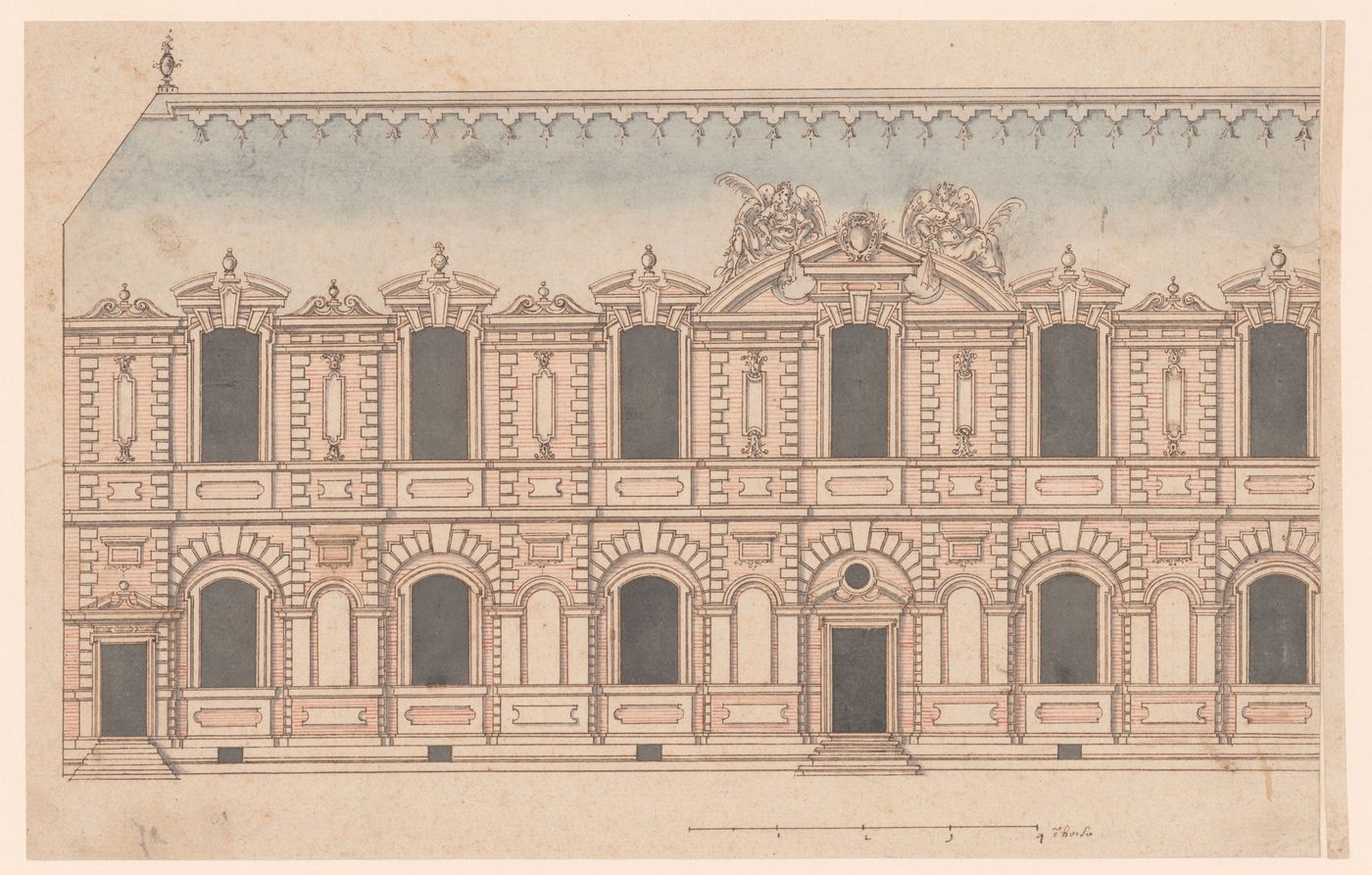
Elevation of a palace façade
first quarter of the 16th century
This drawing shows an exterior of a residential building. The artist uses color to suggest the materials used in construction; blue-grey for the pitched slate roof, brown for masonry details and architectural sculpture, and red striations for brickwork. This combination of materials was common in early modern France, where a play on color and materiality enlivened the façades of well-known royal edifices including the chateaux of Fontainebleau and Saint-Germain-en-Laye.
As with the construction technique that interwove stone with brick, the architectural style depicted in the drawing combines traditional French ideas about building with classicizing elements imported to France via Italian artists and architects as well as through printed translations of Vitruvius’s 'De architectura' and Sebastiano Serlio’s architectural treatise. The inclusion of masonry rustication and the decorative urns that punctuate the roofline suggest a knowledge of classicizing trends in architectural ornament and a familiarity with the œuvre of artists working in the circle of the first and second Écoles de Fontainebleau. The structure’s elongated form suggests a gallery and the organization of the façade borrows the combination of slightly protruding vertical bays and long horizontal registers that characterizes Pierre Lescot’s wing of the Louvre, a project that would have been well-known in court circles in the latter half of the sixteenth century. Similarly, the two winged allegorical figures flanking the central pediment are reminiscent of Jean Goujon’s sculptural additions to the Lescot wing. In the Canadian Centre for Architecture’s drawing both figures hold palms, but the artist omitted any further identifying attributes, perhaps – along with the empty niches – as an invitation for the patron to imagine his or her own thematic program for the project.
Sepia and red ink with dark brown and blue-grey watercolour wash on beige wove paper
sheet: 23 × 36 cm (9 1/16 × 14 3/16 in.)
DR1970:0003
- The tones of the ink and washes are used to suggest building materials. Small pinpricks throughout the drawing indicate the use of a compass. These are most visible in the semi-circular niches and windows and in the central oculus. - Slight staining on the paper at bottom left and right.
Recto, bottom right, in ink: scale with measurements – “1 / 2 / 3 / 4 ẽ toise”
Sign up to get news from us
Thank you for signing up. You'll begin to receive emails from us shortly.
We’re not able to update your preferences at the moment. Please try again later.
You’ve already subscribed with this email address. If you’d like to subscribe with another, please try again.
This email was permanently deleted from our database. If you’d like to resubscribe with this email, please contact us
Please complete the form below to buy:
[Title of the book, authors]
ISBN: [ISBN of the book]
Price [Price of book]
Thank you for placing an order. We will contact you shortly.
We’re not able to process your request at the moment. Please try again later.
Your folder is empty.