Entering the Galleries

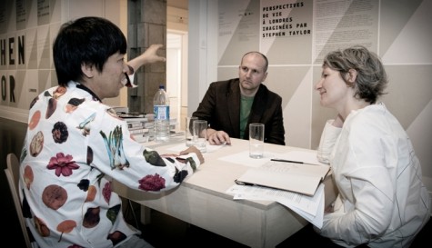
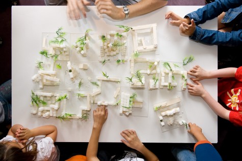
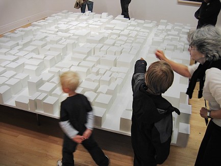
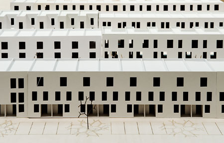
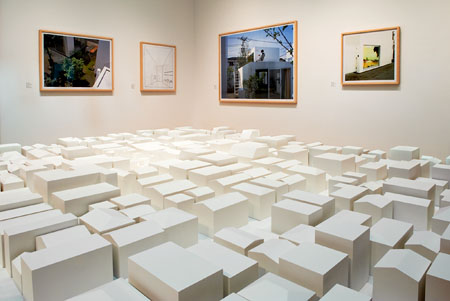
For Some Ideas, curator Giovanni Borasi and the exhibition team designed the installation with two distinct entrances to the galleries, offering visitors the opportunity to begin with the work of Stephen Taylor or that of Ryue Nishizawa, with London or with Tokyo.

Photos by Michel Legendre © Canadian Centre for Architecture.







Who did the typography?
The typography and graphic design of the exhibition are by Montréal-based Studio FEED.
The large letters spelling the names of the architects are printed on individual posters arranged side by side - a kind of tribute to a typical feature of urban environments, where fences and construction site hoardings are papered over with advertisements and imagery.