Arata Isozaki and the Invisible Technicians
Text by Matthew Allen
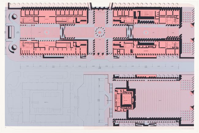
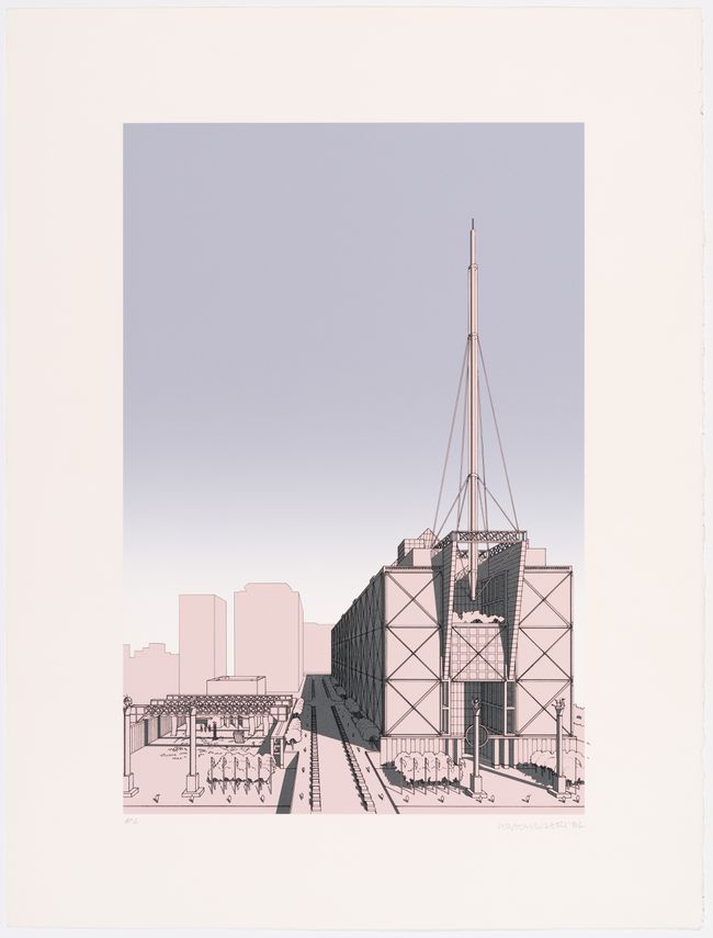
In the spring of 1986, Kenzo Tange won the competition for the New Tokyo City Hall. But many observers agreed that the most exciting project had been submitted by Tange’s protégé, Arata Isozaki.1 For his entry, Isozaki produced fourteen silkscreen prints that have become icons of the era. But another, lesser-known set of prints from the competition marks a genuine shift: a moment when the avant-garde of architectural notation moved from ink-on-velum to a new medium, the computer printout. By the late 1980s, this was a shift that could no longer be avoided. A generation of young architects was starting to practice in a computer-saturated world, and they were inclined to think about architecture through a new computational imaginary. In his competition entry, Isozaki—who came from an older generation—began to grapple with this sensibility. New notions of space, form, colour, and inhabitation worked their way into his firm’s conceptual palette. Looking closely, we can see a new ontology for architecture emerging, an older understanding of form and representation giving way to the idea that architecture can exist within the computer.
-
See for example “Entries of the Designated Competition for a Design for the New Tokyo City Hall,” Japan Architect 61, no. 7 (July 1986). ↩
Architects working with computers today can claim this ontology as part of their own tradition. As Isozaki’s images show, this tradition is not confined to Western Europe and North America, nor is it limited to the signature styles of star architects. Rather, it is part of a genealogy that belongs to a global culture of creative labourers whose imagination of architecture cannot be separated from the way they use and think about computers. We might call them “invisible technicians,”1 “CAD monkeys,” or simply interns; whatever their name, their role in creating contemporary architectural culture should not be underestimated.
Read more
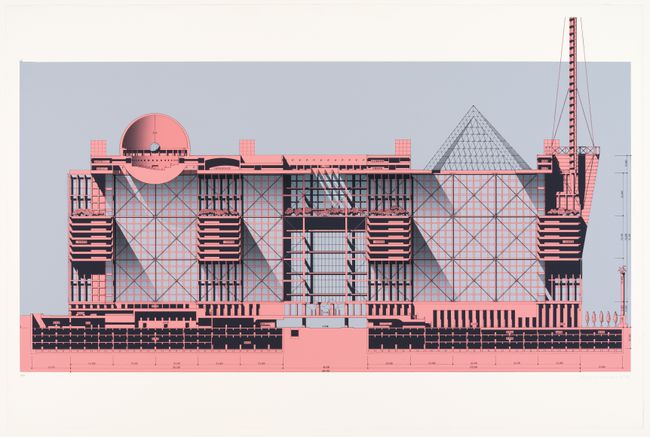
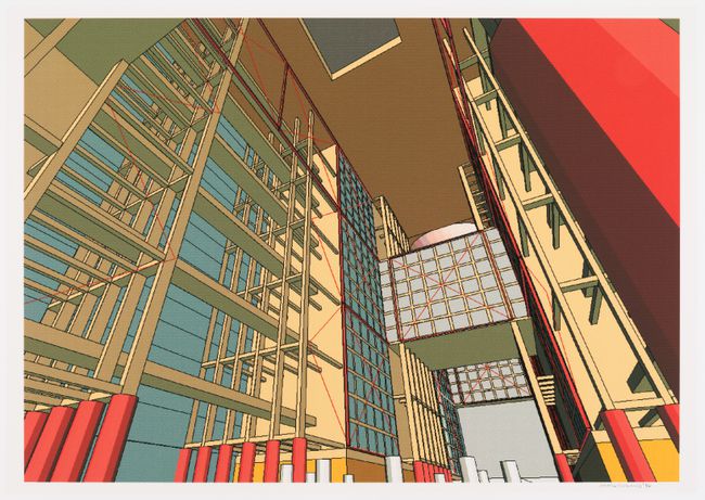
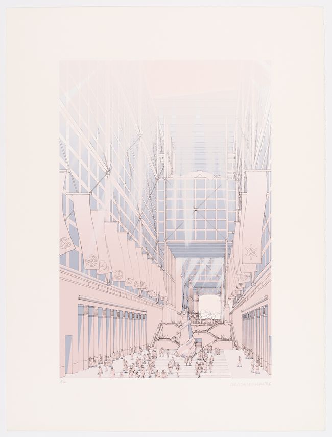
Isozaki’s competition entry exhibits a split personality: on one side are the practices of drawing that stretch back to the Renaissance, on the other are the conventions of computer-generated images that descended from the first interactive screens of the 1960s. When it came to paper, architects in the 1980s were still supremely in command. Isozaki’s silkscreen drawings are highly refined artifacts. Their three layers of colour—muted red, soft blue, and black—are carefully interwoven to suggest a spatial gradient from outside to inside.
-
Steve Shapin, “The Invisible Technician,” American Scientist 77, no. 6 (November–December 1989): 554–563. ↩
These tricks of colour and linework imply a whole philosophy of civic life: as the competition text puts it, “we propose a ‘Rhizome’ model… [that] organizes horizontal and vertical transportation into the three dimensional grids and includes large halls and interface zones which attract the public into the building.”1 At the same time, thick black shadows mark moments of enclosure, depth, and surprisingly stark divisions of space. Isozaki is not afraid to depict inhabitable zones as blocks of solid ink. A layer of translucent silver ink on parts of the drawings makes the darkest shadows shimmer and glow—an effect that can only be experienced when taking a closer look in person. The compositional space of the drawings is equally striking. One of the renderings is an unusual elevation-oblique perspective. The facade of the building that faces the viewer is drawn orthogonally, in elevation, which implies classical formality; the side of the building, in contrast, is grafted on as a dramatic perspective, creating a dark bulk meant to frame a modern public space. This is a rendering that deviates from textbook perspectival composition, but it reveals its deviance only on close inspection. Isozaki makes subtle formal moves to convey subtle ideas, connecting marks on paper to the finer points of spatial ideology.
-
Arata Isozaki, “Taking Part in Contests: On the Design of the New Tokyo City Hall,” Japan Architect 61, no. 7 (July 1986): 10–13. ↩
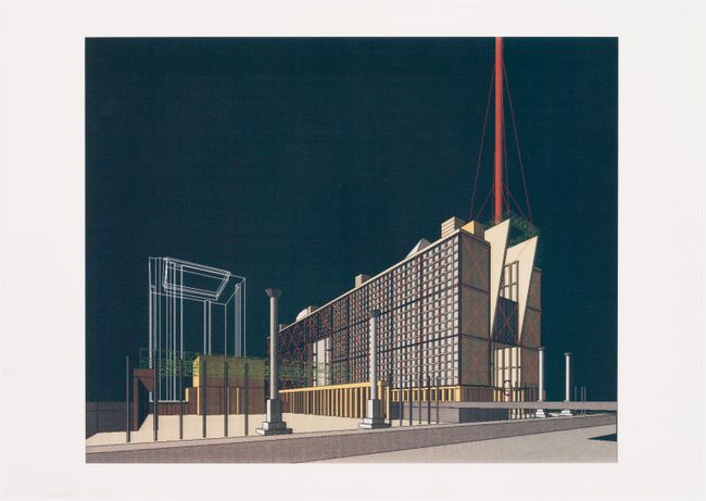
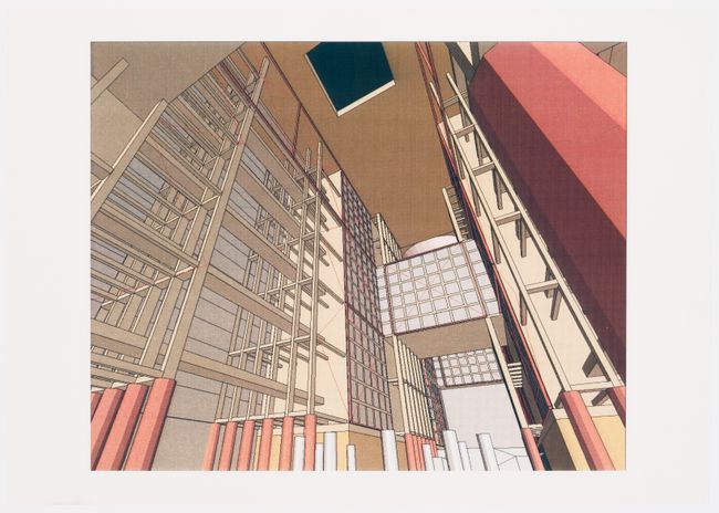
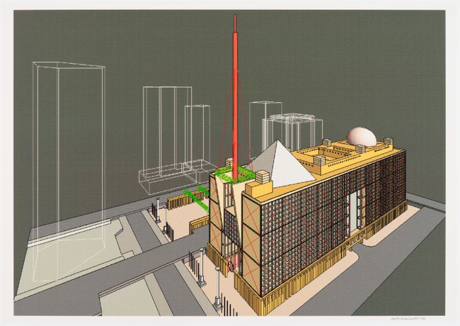
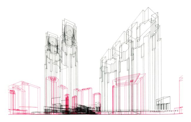
Isozaki’s computer-generated images, however, are something else. Like a world that has come unhinged once the sun has set, the pastel backdrop is replaced by looming wireframe towers set against a black sky. Conventional details have disappeared, to be replaced by patterns of pixels and colour dithering. The building takes on a palette that seems to correspond to the way it was modelled in the computer: the grid geometry is white, the tensile members are red, and the trusses are green. The viewer has left the world of sophisticated postmodernism and entered an un-self-conscious reenactment of form-follows-function. It is difficult to see how the same architects could have been involved with both sets of images.
It comes almost as a relief to learn that the computer-generated images were not, in fact, created by Arata Isozaki & Associates, but were contracted to a computer services firm in Tokyo.1 The implications of this seem shocking nonetheless: Isozaki had ceded aesthetic control of the representation of a major project to the computer and its technicians. When the images arrived on Isozaki’s desk he was confronted with a strange new universe of aesthetic associations, the ideological corollaries of which were not yet fully mapped. The decision to include these foreign images in his competition presentation represents a watershed moment, an “epoch-making event:” according to Robert Bruegmann, it was “the first large-scale demonstration to the profession that computer graphics had finally started to come of age.”2
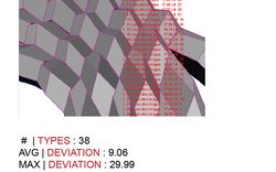
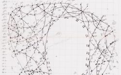
Because Isozaki’s computer-generated images were not authored in the classical sense, a methodological shift is needed to understand them. One possibility is to imagine that media have their own agency. To begin with, each medium dictates its own workflow. In the CCA archives, three versions of Isozaki’s computer-generated images exist, each created using a different media technology. One is a set of thermal prints.
-
Isozaki worked with the firm ARC Yamagiwa, which used McDonnel Douglas’s Graphic Design System (GDS) software, developed by Applied Research of Cambridge (ARC). Susan Doubilet, “P/A Technics: British Software Development,” Progressive Architecture 6, no. 86 (June 1986): 105. ↩
-
Robert Bruegmann, “The Pencil and the Electronic Sketchboard: Architectural Representation and the Computer,” in Architecture and Its Image: Four Centuries of Architectural Representation, eds. Eve Blau and Edward Kaufman (Montreal: Canadian Centre for Architecture, 1989), 139–155. See also Process, “Proposals for the Competition of New Tokyo City Hall Complex,” Special Issue 4 (1986). ↩
Thermal printers were relatively inexpensive in the 1980s, and they output in relatively small formats.1 The images they produced should perhaps not be thought of as formal renderings, but rather as quick-and-dirty references to digital models. This is the kind of image that might have been shown to a client in an informal meeting. They were cheap printouts that no one would mind marking up—napkin sketches in a digital age. Another medium through which computers entered the architectural workflow was the photographic print. The technology for capturing photographs of screens dates to the 1950s; so-called “microfilm plotters” were a convenient way for researchers with stratospheric budgets to duplicate what they saw on their cathode ray tubes.2 By the 1980s, several companies sold cameras mounted to screens for creating “screenshots.”3 These produced small images that were dark and glossy, with some of the aura of photographs. Unlike the thermal prints, the CCA keeps Isozaki’s photographic prints neatly mounted, like precious art objects. The final type of image produced for the competition was the ink-jet print, a more recent and initially more expensive technology. These images could be produced in larger formats and had richer colours—they gave rise to an industry of “fine-art prints” in the 1990s.4 For Isozaki, these were the “final renderings” of the project, and the ones offered to the CCA for exhibition.5
-
Martin Jurgens, The Digital Print: Identification and Preservation (Los Angeles: Getty Conservation Institute, 2009). ↩
-
Zabet Patterson, Peripheral Visions: Bell Labs, the S-C 4020, and the Origins of Computer Art (Cambridge, MA: MIT Press, 2015); Matthew Allen, “Representing Computer-Aided Design: Screenshots and the Interactive Computer circa 1960,” Perspectives on Science 24, no. 6 (2016): 637–668. ↩
-
See for example John Lewell, A–Z Guide to Computer Graphics (New York: McGraw-Hill, 1985). ↩
-
Jurgens, The Digital Print. ↩
-
Isozaki’s images of the New Tokyo City Hall were acquired by the CCA to illustrate the emergence of computer graphics in architecture for the 1989 exhibition Architecture and Its Image. ↩
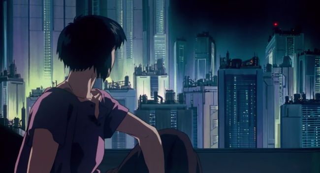
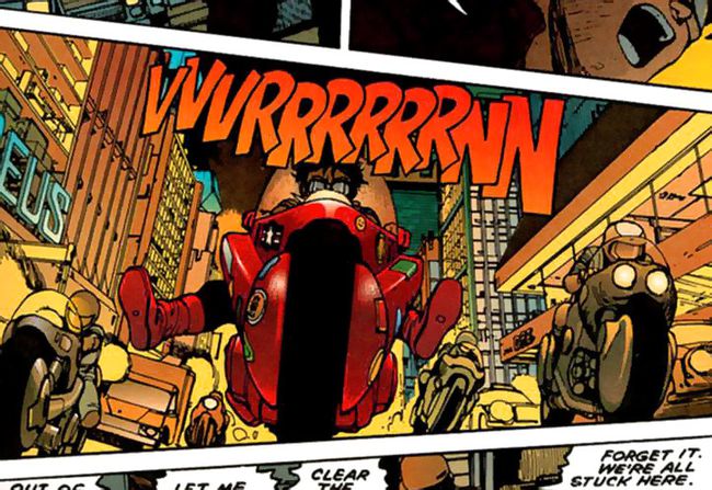
Besides having a unique place within architectural production of the time, each media forces a certain colour palette on its users. Isozaki’s photographic prints feature darker tones than the other printouts. The black is very black, allowing white lines to glow in high contrast like neon tubes against the night sky. Some of Isozaki’s photographic prints evoke the techno-dystopian mood of the 1980s and 1990s in Japan as vividly as the anime that is often associated with it, such as the iconic Ghost in the Shell, released toward the end of the era in 1995. In Isozaki’s ink-jet prints, the black background is replaced with olive green, which complements the red tower and bright green trusses. Here the saturated reds evoke another contemporary pop medium: manga. The computer-coloured version of Akira, with its iconic futuristic red motorcycle, was released in 1988. In comparison with the other media used by Isozaki, his thermal prints look washed out. Their tones are closest to the pastels of the silkscreen prints, but they feel muted and indecisive, in contrast with the richness of the silkscreens.
All this—the pop-culture colour references and the colour failures—shows that Isozaki was experimenting, or at least that the structure of his firm allowed for experimentation. And experimentation was accompanied, perhaps inevitably, by anxious negotiations with established values surrounding standards of representation. In letters between Isozaki’s firm and the CCA, Eve Blau, a curator at the CCA, tries to pin down which prints were submitted for the competition and which colours the jury would have seen. She is clearly frustrated by the variations between media. A slight sense of embarrassment comes through from the other end as well: embarrassment that the firm does not have complete control over its aesthetic output.
This loss of control extended to conceptual production. Isozaki’s computer-generated images mark a moment when even fundamental architectural notions were subject to the capabilities of the computer. Take inhabitation. The silkscreen perspectives either contain a few figures or are positively teeming with people while the computer-generated images show no human presence.
It is as if the viewer and everyone else have shed their bodies to enter a virtual world. Not that there was much of a choice: in the 1980s there were no libraries of 3D people, no way to add entourage in Photoshop post-production. The visual character of the city is likewise at the mercy of computational limitations. While nearby buildings are depicted in wireframe, the rest of Tokyo is simply left out. A few adjacent roads and sidewalks form an island of context floating in virtual space. Even space itself seems to have undergone a radical transformation. Geometry is no longer carefully formal, but distorted and vertiginous as if accelerated.
Taken together, the computer’s implications fall into the category of what Roland Barthes calls “mythical thinking.” Myth, as opposed to more straightforward signification, is characterized by highly questionable strings of association. For example: a rendering is proof that a project exists within the computer, and if this is the case, and if it is also the case that a computer is a ruthlessly rational machine, then the project must therefore be optimal and the architect must be a master of objectivity. The point, according to Barthes, is not to decode and unravel these myths, but to map them.
The myths of computer-generated images resonate beyond the work of any one architect. Isozaki’s images mark the moment when even small firms could afford to experiment with computers and they speak to a general trend that can be seen as the beginning of the contemporary period of the use of digital tools. We might have expected Isozaki to have been experimenting with new technology in the 1980s, but even his more conservative competitors—whom he called the “corporate postmodernists”—found reason to use computers. Several of the other firms in the New Tokyo City Hall competition produced computer-generated images. Tange, for one, submitted beautifully abstract black-and-magenta wireframe drawings.1
-
Process, “Proposals for the Competition of New Tokyo City Hall Complex.” ↩
Why do we see this in 1986 but not earlier? The IBM Personal Computer had been released in 1981, and AutoCAD had followed in 1982, but sophisticated computer graphics like those of Isozaki’s renderings required more expensive hardware and software that emerged a few years later. In addition, the new infrastructure of “service bureaus” created a market for computer renderings. By 1986, commissioning a computer rendering required only minimal commitment from the architect. Isozaki’s renderings seem to have been outsourced on a whim, and they were left out of most publications of the project.
Computational aesthetics was not invented in 1986. Rather, this was the moment when a vast, pre-existing conceptual universe of computer graphics collided with mainstream architecture. The aesthetics of images like Isozaki’s comes largely from the software and output devices they used, and this software was often created without the involvement of an architect. We ought therefore to think of the invisible technicians who created the software as co-authors of the architecture that the software produced. Architects could choose to wrestle software to fit their own sensibility or they could submit to its alien defaults, but most often they chose a negotiation.
The introduction of computer graphics into architecture effected a complete re-distribution of the sensible. We are only beginning to map where we have ended up. Rare projects such as Isozaki’s competition entry allow us to see in great detail how specific architectural concepts move: we need only compare the concepts behind the silkscreen prints and the computer-generated images. What seems most striking is that the concepts to which architecture had to adjust itself came from a social stratum that had not previously held cultural sway: the invisible technicians and software operators at the bottom of the professional hierarchy. The tradition of design (a rarefied art, the privilege of principals) gave way to pop-culture graphics, and architecture began to revolve around “the contemporary”—staying cool with new technology and new aesthetics.1 Architects came to accept an avant-garde way of working from the bottom up, built on screenshots and printouts.
-
Sylvia Lavin, Flash in the Pan (London: AA Publications, 2015). ↩
Matthew Allen was here as a PhD candidate for a research residency in summer 2016.


